Simon Sitanala
Eye Filmmuseum wanted their website to work as both a ticketing platform and a living film archive. Those are two different user needs, and the existing site wasn't serving either well. I set the design direction, led the team, and stayed hands-on throughout. Shaping the visual language, making key UX calls, and keeping the work sharp across a long-running project with a lot of stakeholders. Over multiple years we improved the agenda usability, which had a direct impact on ticket sales. Fewer people bounced, more people stayed and explored the archive.
With the team at Bravoure, Creative Direction, Digital Design, Growth
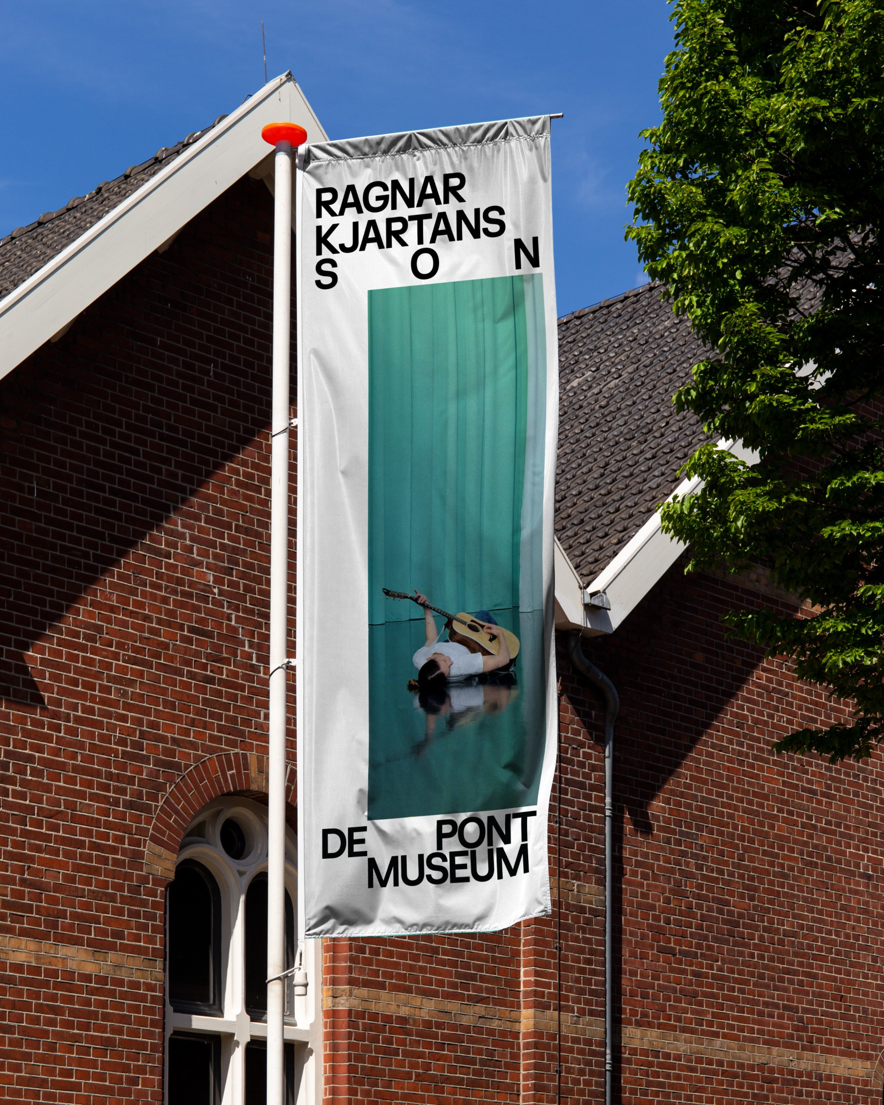
De Pont has a fundamentally different relationship with art than most museums. The building adapts to the artist, not the other way around. No fixed layout, no curatorial layer filtering the experience. Pure. That starting point called for a visual identity that reflects the same principle.
We developed a custom typeface, drawn from the geometric and diagonal forms of the building. The space in the typography isn't a stylistic choice, it's a statement. Letter spacing and placement as tools to make flexibility tangible. The identity breathes the same space the museum gives its artists.
With the team at Bravoure, Brand Identity, Type Design, Art Direction
Kalkhoff makes quality e-bikes, but their digital experience didn't reflect that. Users were comparing models, getting lost, and dropping off before reaching a dealer. Worked hands-on with the team through to execution. From the research findings to the final UX/UI calls. The result is a redesigned buying flow that surfaces the right details at each decision point, without overwhelming the user. An experience that matches the quality of the bikes themselves.
With the team at Bravoure, Product Design, Workshop, UX Research, Design System
ADE runs across the entire city for a week. Thousands of events, two very different audiences in festival visitors and industry professionals, and one app to serve them both. I led the product design and stayed hands-on throughout. A big part of the work was making sense of complex API data and designing an AI-driven personalisation and matchmaking system that connects people to the right events, artists, and peers. Stakeholders had an ambitious wishlist. Deciding what made the cut, and convincing people why, was as much the job as the design itself.
With the team at Bravoure, Product Design, Personalisation, Design System
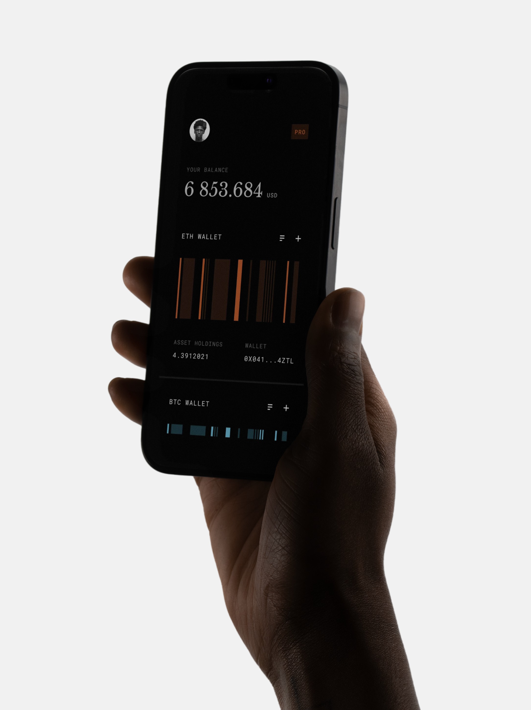
Finance apps carry a lot of information. Account overviews, transactions, investments, analytics. The challenge is making all of that readable without it feeling like a spreadsheet. Neo banks have changed what people expect visually, and that gap between data density and good design is what drew me to this. I wanted to explore how far you could push the visual quality without losing clarity. I went dark. Not because it's trendy, but because it gave the data room to breathe and made the hierarchy easier to read at a glance.
Awakenings Upclose
Branding
2024
Awakenings had a gap in their festival portfolio. Everything they did was large, massive, maximal. There was room for something different, a festival that's small and intimate. That's Upclose.
I came up with the name, shaped the concept, and built everything from there. Stage design, art direction for film and photography, print and social. Upclose sits in direct contrast to the parent brand, and that was the point. Intimacy as a proposition, not a limitation. Beyond the execution, I was also involved in the launch strategy, how you position a new festival within an established brand without diluting either.
With the team at Bravoure, Brand Identity, Concept, Art Direction, Launch Strategy
CLIQ set out to build Germany's first all-in-one streaming platform. Movies, series, music, audiobooks, sports and games in a single product. Making that breadth feel simple was the core challenge. From the ground up, I led the design across mobile, web and three TV platforms. Six content categories, six surfaces, keeping that consistent and coherent was the real complexity. The visual design was built around approachability. For example, research showed that dark mode apps feel more premium and put everyday users off buying. So we went light, deliberately.
With the team at Bravoure, Product Design, Multi-platform, Design System
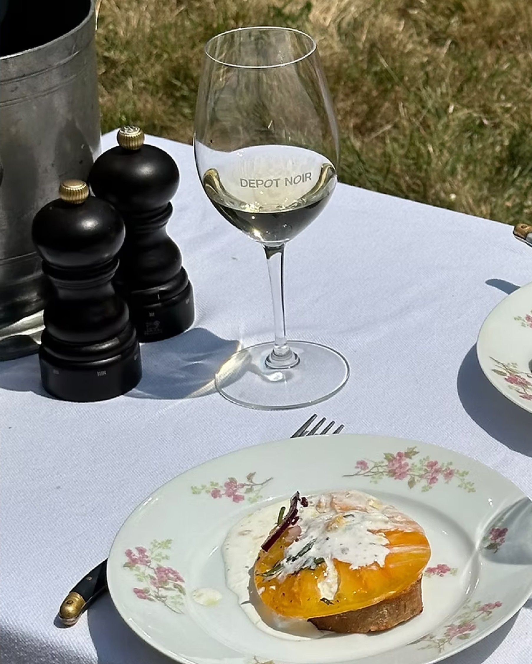
Depot Noir set out to rethink how people buy, store, and manage premium wine. The wine market has two ends: approachable but shallow, or authoritative but closed off. The strategy was to own the space in between. A digital-first wine authority that appeals to a new generation of collectors without losing the weight the category carries.
I led the brand and art direction from the ground up. Positioning, visual identity, tone of voice. From that foundation we moved into product, using AI prototyping to validate the experience early and keep the quality bar high throughout. The result is a platform where the brand and the product feel like the same thing.
With the team at Bravoure, Strategy, Brand Identity, Art Direction
Get in touch for project inquiries
E-mail
sitanala.simon@gmail.com